

So this past month was the "split focus test" and it turned out to not be so bad after all. Having to work on Pirates Vs Pirates and a portfolio piece at the same time (with equal amounts of attention and love) proved to be hectic at times but in the end it turned out just fine.
For this last class we basically had the month to create a portfolio piece. I've always wanted to try my hand at a hand-painted environment so I figured this would be a great time to have a go at it. When I sat down to think about what I should do my mind went straight to a blacksmith/forge house. I wanted to play with lots of vegetation so bamboo came to mind right away, the asian theme came right after that thought. I began to look on flickr and began finding some really cool photos of pagoda/temples, and in a completely roundabout way I arrived at Blizzard's new Pandaria concept art. Once I hit that vault of amazing art, inspiration began to flow and it wasn't long until I had a solid idea of what I wanted to do.
Here is how the final turn-in came out:


I've always really enjoyed seeing breakdowns of progress on artwork so this time around I made sure to take a screenshot of the scene every night. One thing that I absolutely learned with this project is the value of paintovers. There were times I would look at the scene and couldn't really see how I could push it further. Taking a screenshot and bringing it to photoshop for a quick paintover was a crucial step to find new ways to lay things out. Here are a couple of the ones I found most interesting:
 |
| Blockout - week 1 |
 |
| Paintover - week1 |
 |
| Maya screenshot - week 2 |
 |
| UDK screenshot -week 3 |
 |
| Paintover - week 3 |
 |
| UDK screenshot - week 4 |
 |
| UDK screenshot - final |
Overall I'm pretty happy with how it turned out and I can't wait to start a new project!
Blacksmith House

So this past month was our first actual month of production. It was refreshing to have the entire time dedicated to just producing, something we hadn't done for quite some time.
One of the things that I absolutely noticed is just how incredibly helpful it was to have all the pre-pro done ahead of time. On the art side things were very smooth because all our tasks were already set up and we were able to focus entirely on the actual creation. For the design our Design Document proved simply invaluable.
As we begun to piece things together I was amazed to see how smoothly the overall design of the game went. Time and time again I am reminded of just how crucial communication is; it really takes a situation like this to prove just how difficult it can be. The funny part is that it's not the conflicts that boggle my mind, but rather how different ideas can be even if we all started out at the same spot.
I was in charge of the majority of the art for the gameplay elements our game. I started out working some more of the floor of the player ship and by the time I was done with it I was getting pretty tired of doing wood planks. The way I went about the floor was to have a single huge texture that has localized details for where the paths/damage from walking among other more subtle details. These aren't present in the first pass of the texture but will be in the coming months as well as any lighting for the props.
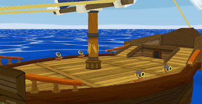

After that I started working on the outside of the player ship. I ended up leaving this until about half way through the month because we weren't sure if the size of the ship would be optimal for gameplay. This brings up a point that I noticed to be quite fun actually. Having to "work around" gameplay and keep in mind certain constraints (camera collision, resolution) is a process in itself. There were certain aspects of the ship that were pretty much set in stone because of the design of the game, and paying attention to those details ended up influencing much of the ship's design.


I played with the shapes of the ship for quite some time, once I was comfortable with the silhouette and other details I begun to chisel out the actual parts of the ship. I used a few repeatable textures for any railing and elements that could benefit from the same texture being used over and over. Overall I ended up with 2 textures for the unique front and back "chunks", two different beams, and the side wood of the hull. Working with repeatables can be tricky but I also find it fun to push textures and use them in ways you normally wouldn't think of.


Overall it was a very good month. Having our core build being so strong allowed us to really push our game and have fun with it. This next month the artists will be having a portfolio class along side of the game project so it will be interesting to see how well we handle having the split in focus.
Pirates Vs Pirates Production Month 1

During the first month of Game Project we created a Design Document for the game we are currently working on. The project as a whole takes place over a period of 5 months. Day one being the first time you meet your team members, and the last day being the turn in for the game presentation. It is a very fast paced project as we have milestones set up roughly at the end of each month.
The game we are creating is called Pirates Vs Pirates. It is a 3rd person game where you play as the First Mate of a stolen ship on your quest for treasure. You must protect your Captain and the ship's mast from enemy pirates. You must shoot oncoming enemy boats with the cannons mounted on the sides of your ship and sink them before they get too close. If the enemy boards your boat they will run towards the mast of your ship and try to destroy it before attacking the Captain, at this point they are running around your deck and you must melee them down with your cutlass. If you manage to survive the enemy waves you will reach the island where the treasure is hidden and win the game!
 |
| Concept art by Quinlan Septer |
I was very involved in the design process of our game and it actually rekindled a love for game design that I have had ever since I was young. It is incredibly interesting to see how things developed in a team project, especially in the early stages where all 14 of us are still getting used to each other's communication styles. I would say that getting everyone in the same page proved to be the biggest hurdle early on, and because of this I made sure to be very visual and thorough with descriptions.
In order to create a more visual design document I ended up using Sketchup for every aspect of design elements. It was amazing to see how helpful it was to have something in 3D to demonstrate details and in turn it allowed us to push further on many areas instead of having to focus on communication difficulties.
The way I went about this was to create a "walk-through" of how the player would see each element in our game. From blocked out cut-scenes to in-game actions, everything was documented in one way or another. Once everyone saw how things were to be laid out we then looked at how elements fit together and ultimately allowed us to create a better game design. Small details aren't important at this stage, what is key is to have everyone in the same page and be confident about the design.
 |
| Enemy hits mast, health goes down! |
 |
| Player repairs mast, health goes up! |
With the basic elements of the game laid out we then begun to play with numbers and had very early balancing passes. The numbers themselves might not be accurate but it's the process that is important.
It is incredible to see how smooth the process has been for us, and I have no doubt in my mind that our strong pre-pro and planning were the reasons for this. Planning simply works, and when it comes to big teams like this it alone can make or break projects.
Pirates Vs Pirates Design

A few months ago I decided to try my hand at the ArenaNet internship art test.
I actually learned a lot from it and I am very happy I did it. I ended up not hearing about it until about a week before the due date, and at the time we were very close to a turn-in for game project so I wasn't really able to work on it until about 3 days before the deadline.
So for the art test we were given this concept for a building:

The limitations were that it must be under 3000 triangles and have a maximum of 2 1024x1024 textures. Here are some screen-caps of the final product:


Overall this was a great learning experience and I am happy I did it. Playing around with vert colors for lighting was really fun and I am happy with the result of having a piece that can stand on its own without needing fancy lighting or rendering techniques to hold itself up.
ArenaNet 2011 Intership Art Test

It's been a while since I've posted here but lots has happened! I now have a website so be sure to check out www.kennethkozan.com for my portfolio pieces. This blog will be a more laid back and "non-official" approach to my work and what I'm currently doing.
So during the past few months I've been working on a student game project. In the first months I worked on an idea with a team but after a while we realized things weren't really working out so we decided to start over from scratch.
The assets were all scrapped but it was a great learning experience. I was in charge of creating our 3D menu and it was actually really neat to use Maya to create something that isn't traditionally thought of as an asset.
This is the original concept for the menu done in Photoshop:

And here is a render of the actual 3D menu put together:

Since there are so many dynamic elements to the menu, a still really doesn't do it justice. Here's a render of the 20 second loop of the different elements that move around and do other crazy stuff. All of these animations are tied to joints so they carry through the game engine seamlessly.
It was really fun to use cards and texture to create this complex looking menu. The entire structure is "flat" but has depth to it. Each element that moves was bound to a joint so the animation could be baked down and exported out of Maya with no troubles. Since each option was attached to a specific joint, the programmers were able to gather information though that, allowing it to be as easy to implement as possible.
I did a quick render of the perspective view in Maya to show that the menu isn't flat, but rather tiered down with transparencies while being looked at through a "flat" camera with a very large focal length.
Game Menu

During this past month I focused on creating an environment inside of UDK that was inspired by a real life location. I've always taken a liking to castles and ruins so I immediately went on Flickr and started browsing the photos for one that could catch my eye.
The fortress Rocca Calascio stood out from the others because of it's unique look. It seems that it is almost one with the rocks of the mountain, and in a way it seems that it has replaced the peak of the mountain it sits on.

After gathering a good selection of reference photos of Rocca Calascio I began to block things out and started composing the scene. The idea was to use the real life photo as an inspiration for the scene and not photo recreate it, but rather create an environment that could be used in-game based on the location. Not only that but to also push the look and contrast (while staying within a realistic style) because let's face it, reality can be pretty boring most of the time.
I modeled,textured, and lit everything in the scene. Here are a few shots of the final product:


During the first few days I began to realize just how difficult it is to create a natural environment. The organized chaos and meticulous destruction that nature creates over hundreds of years of constant wear on the rocks is incredibly difficult to mimic. I am happy to say that I have taken a whole new level of appreciation not only for nature itself but how other artists go about recreating it.