Pirates Vs Pirates Production Month 1

So this past month was our first actual month of production. It was refreshing to have the entire time dedicated to just producing, something we hadn't done for quite some time.
One of the things that I absolutely noticed is just how incredibly helpful it was to have all the pre-pro done ahead of time. On the art side things were very smooth because all our tasks were already set up and we were able to focus entirely on the actual creation. For the design our Design Document proved simply invaluable.
As we begun to piece things together I was amazed to see how smoothly the overall design of the game went. Time and time again I am reminded of just how crucial communication is; it really takes a situation like this to prove just how difficult it can be. The funny part is that it's not the conflicts that boggle my mind, but rather how different ideas can be even if we all started out at the same spot.
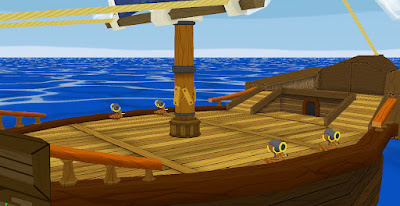
I was in charge of the majority of the art for the gameplay elements our game. I started out working some more of the floor of the player ship and by the time I was done with it I was getting pretty tired of doing wood planks. The way I went about the floor was to have a single huge texture that has localized details for where the paths/damage from walking among other more subtle details. These aren't present in the first pass of the texture but will be in the coming months as well as any lighting for the props.
After that I started working on the outside of the player ship. I ended up leaving this until about half way through the month because we weren't sure if the size of the ship would be optimal for gameplay. This brings up a point that I noticed to be quite fun actually. Having to "work around" gameplay and keep in mind certain constraints (camera collision, resolution) is a process in itself. There were certain aspects of the ship that were pretty much set in stone because of the design of the game, and paying attention to those details ended up influencing much of the ship's design.
I played with the shapes of the ship for quite some time, once I was comfortable with the silhouette and other details I begun to chisel out the actual parts of the ship. I used a few repeatable textures for any railing and elements that could benefit from the same texture being used over and over. Overall I ended up with 2 textures for the unique front and back "chunks", two different beams, and the side wood of the hull. Working with repeatables can be tricky but I also find it fun to push textures and use them in ways you normally wouldn't think of.
Overall it was a very good month. Having our core build being so strong allowed us to really push our game and have fun with it. This next month the artists will be having a portfolio class along side of the game project so it will be interesting to see how well we handle having the split in focus.


