Some time has passed since my last real entry. I have been working on smaller projects on the side and should have a post for my most recent environment up in a few weeks.
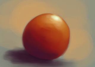
These are a few doodles I've done in the last months. Nothing too fancy, just little drawings of whatever came to mind.
 |
| This is the project I'm currently working on. |
 |
| Antimage Weapon for Dota 2 |
 |
| Quick drawing for the 3D Motive competition |
Doodles
So it's been a few months since I last made a post, but that's because life has been really busy!
At the end of March I graduated from Full Sail University as the Valedictorian of my class. It was an incredible honor to also be picked as the "Advanced Achiever" of my class, an award given to a single member of the graduating class voted to be the one most likely to succeed in their career.
About a week after graduating I got hired at Disney Junction Point Studios as an Environment artist to work on Epic Mickey 2.
I have since moved to Austin, Texas and have been very busy with the crunch hours at the studio. I haven't really been able to tackle on any personal work simply due to the very long hours, but I have been doodling and doing what I can to keep my mind creative.
I might touch up and compile a bunch of these concept sketches in a single post in the near future.
Life Update
Classes are wrapping up for me and I've been juggling time around quite a bit this past month. I got to attend GDC and it was incredible to get to talk to so many artists and meet so many people in such a short amount of time.
I was inspired to start working from the moment I got back home. So what I decided to do was to work on something that could be used on a game that is currently out. I have played League of Legends since the start of their beta a few years ago. Their art-style has always caught my eye so I decided to work on something to fit within their world.
The area around the Dragon enemy always felt a bit empty to me, so I decided to work on a little environment to house him. I figured Roman-ish ruins would fit the theme so I started working by figuring out the perspective and laying out some blockout structures:
 |
| Blockout on left, League of Legends screenshot on right |
After that I tried to see how things could work on the center area. I've been keeping up with the use of paintovers to do this type of concepting and it's been incredibly handy. Here is what I came up with after a bit of working:
 |
| Arena-like! |
 |
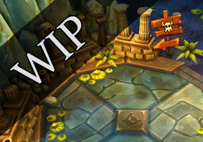
| WIP inside UDK |
I've been putting a heavy focus on making sure things are always low-res and as low poly as possible especially since I've been aiming to have it be as true to the League of Legends specs as possible. here is an atlas of all the textures currently used in my scene:
Dragon Ruins
So with Final Project wrapped up I have found myself in the regular classroom environment once again. I did this little scene in about a week's time off and on as things finished up with our game and I begun to have a bit more free time after class.
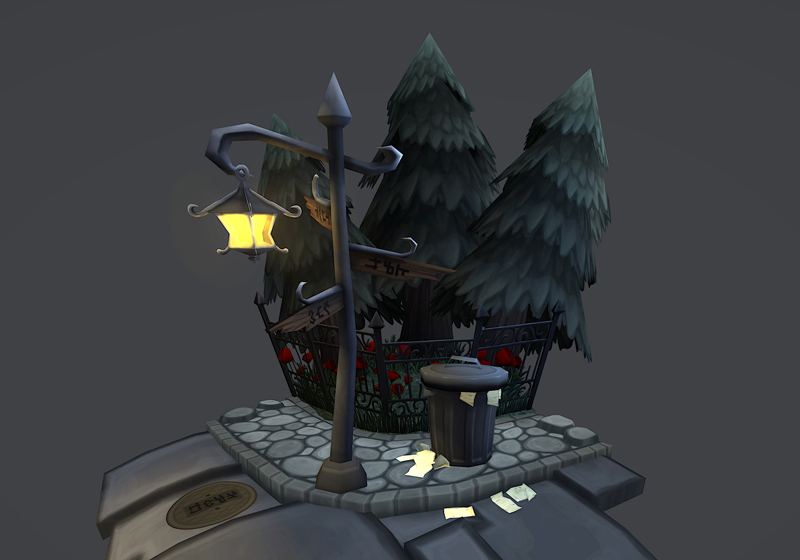
The whole scene kind of came into being after I made a little trashcan prop. I wanted to present it in a nice way so I then made the light post!
 |
| Trashcan! And Mr. Post |
 |
| Rough shapes and test textures |
 |
| Paintover and playing with distort/warp |
Overall this was a very smooth going quick side project. This time around I played with lighting in Marmoset by adding spot and volume lights to the scene that way. Here are some renders of how it turned out:
Also another thing I focused a lot was having things look pretty solid completely unlit in Maya. Here are some screenshots of how it looked like "naked" in Maya.
Lastly here is the atlas for the textures in the scene. I think it's a whole lot of fun to push things as far as specs and resolution goes. The two biggest textures are the sidewalk and the road, other than that everything else is smaller than a 512x512.
Street Corner
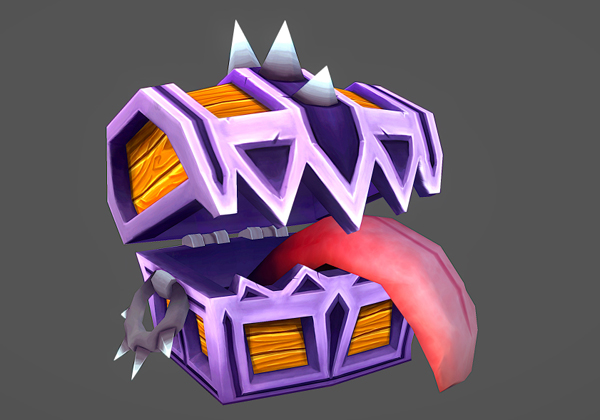
This is a quick little prop I've been working on for the past couple of days. Things are wrapping up with Pirates Vs Pirates so the demand for new art went down a bit - it's been more of tweaking of models/textures that are already in place.
Whenever I play games I always open every treasure chest I see, so mimics have a special place in my heart because they always get me. I wanted to work on a prop so I figured this would be the perfect opportunity to do so.
This time around I wanted to do my own concept so I started laying shapes down and after about an hour this is what I arrived at:
From there it was a matter of modeling and texturing a little bit every night after getting home from working on Pirates Vs Pirates. Overall it took me about 5 days to complete it:
 |
| Wireframe |
 |
| Body Texture |
 |
| Tongue Texture |
For this prop I ended up trying out Marmoset and it's incredible how easy it is to just plug things in and get it rolling quickly. Here's a turnaround of the Mimic:
Mimic Chest
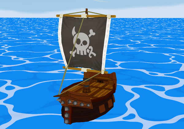
This past milestone we did awesome with Pirates Vs Pirates again. As far as project and design goes, we added the two new enemy types into the game and they really fit right in without having to adjust almost anything of their design. Overall we also tweaked the gameplay of the game and it simply continues to feel better and better with each iteration.
In the end having the split focus between the game project and our portfolio class didn't end up being all that terrible, although I will say that having the artists be physically absent for half the team meetings did cause some gaps in communication and at times I felt a bit disconnected. It really wasn't anything that prevented me from performing, it just took a bit to get back in the swing of the project.
My first task this month was to create the enemy ship. I wanted it to resemble the player's ship but also have a unique silhouette as it came straight at you. The textures still need some tweaking but here is where I am at the moment:
I almost feel like I should add some more spikes, and for next month I will tweak this model for the Blue Sail (bomber) ships.
The silhouette of the cannon wasn't strong enough in it's first iteration, especially from the player perspective. It was hard to see the cannon poking out of the ship so it got a major upgrade in it's size. Here's the comparison of the two:
 |
| New silhouette of cannons |
 |
| New wheel! |
 |
| Floor, now completely flat! |
I'm very excited to be going into this last month of production. There are a lot of little things I want to push in my models and textures, as well as enforce that extra level of polish for the other artist's assets. As a team we aren't rushing to catch up to our deadlines and that couldn't be more perfect - we have the time to focus on making things extra awesome instead of having to cut corners due to time. Overall it's going to be a very fun month!
Check out the gameplay of the video here! Next month I'll have another gameplay video as well as a link to download the final version, so you too will be able to fully experience the awesomness of Pirates Vs Pirates!


